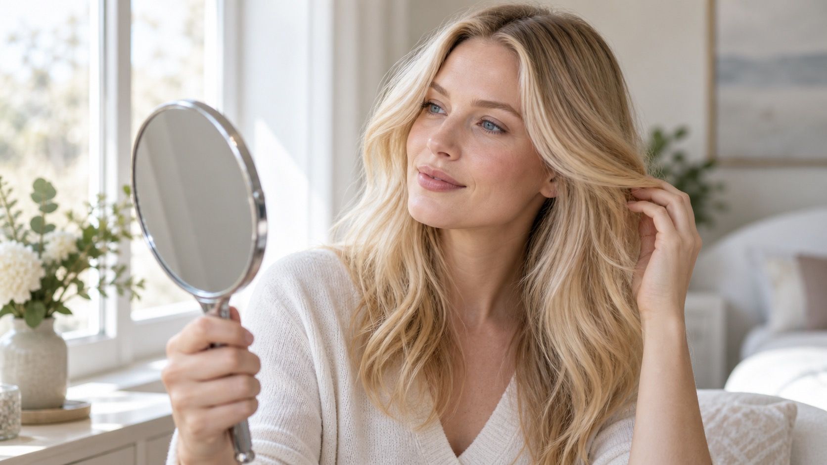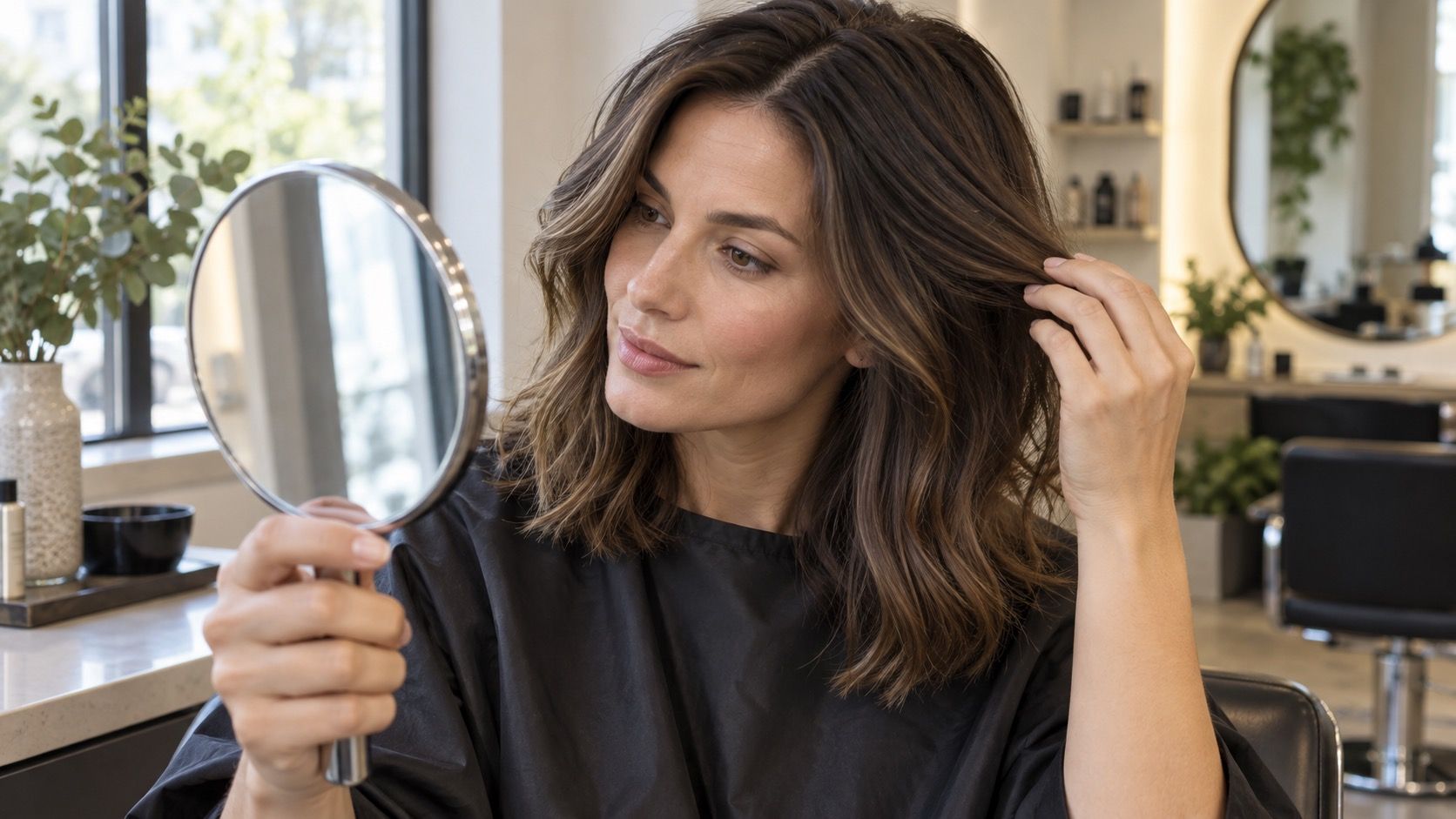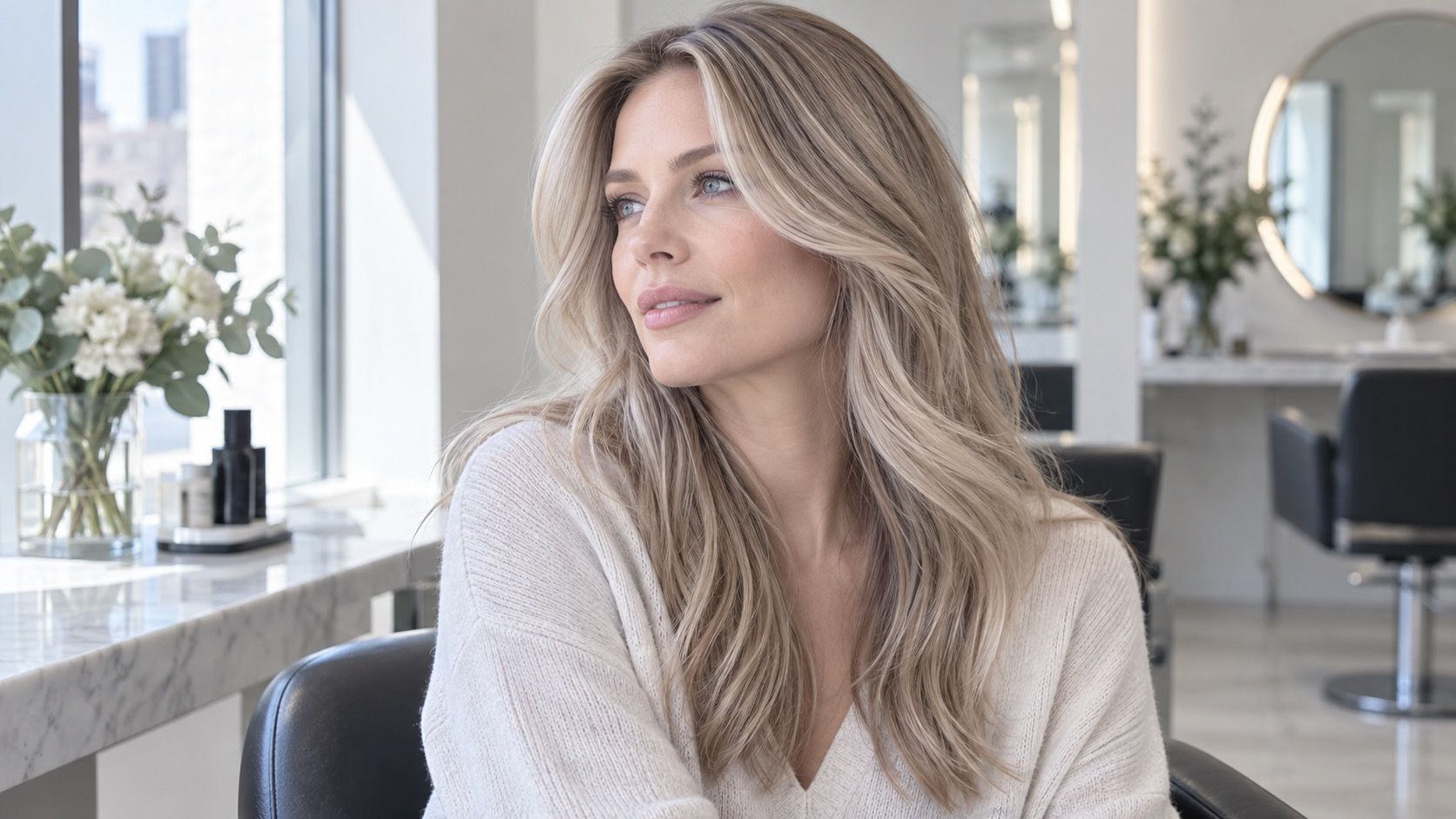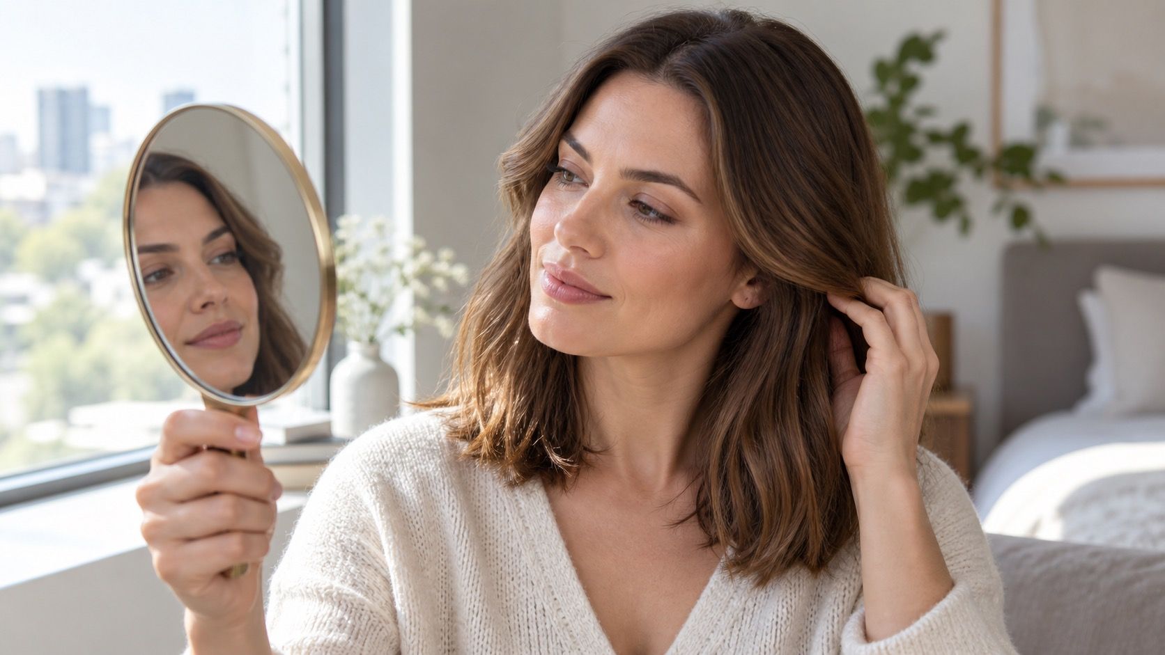
A free virtual hair color try-on is worth using when you need to compare directions before a colour appointment, not when you need a guarantee. The better free tools can help you see whether darker, lighter, warmer, or cooler hair changes the balance of your face. Their limits become obvious once you stop asking them to predict chemistry and start using them to make a sensible shortlist.
Know what a free preview is actually good for
Free previews are good at low-stakes questions. Would a darker frame make your eyes more visible? Does a muted copper feel more natural than a golden blonde? Is a cool brown too flat against your skin? They are less reliable for exact shade names, hairline detail, and multi-step transformations. A clean digital overlay cannot know whether your hair has old box dye on the mids, porous bleached ends, or resistant grey at the temples.
That limitation is useful rather than disappointing. It keeps the test focused on colour families and visual balance. If you find yourself searching for the best virtual hair color try on, judge it by whether it lets you compare a consistent set of changes from the same photo. A tool with fewer swatches and an honest-looking overlay can be more helpful than one offering fifty dramatic effects with a different filter attached to each.
Check the photo and the privacy choice before uploading
Use a current photo that shows your full hairline, both sides of the face, and the natural root area. Window light is usually the easiest starting point because it reveals skin and hair without the harsh shadow of a ceiling lamp. Turn off face-smoothing, colour filters, and portrait blur. A softened jawline and a brightened complexion make a preview look better for reasons that have nothing to do with the hair shade.
It is also reasonable to pause at the upload screen. Read the visible privacy settings, avoid adding personal details you do not need for a simple test, and use an image you would be comfortable storing on the service. Crop out other people, home addresses, or identifiable paperwork in the background. A free hair preview should not require you to give away more than a clear portrait. This small check makes the experiment feel appropriately proportioned.
Test colour families before individual fantasy shades
Start from your actual root. Make one version close to your current depth, one a little lighter, and one a little deeper. Within the most convincing depth, test a restrained warm and restrained cool direction. This sequence answers more than tapping red, pink, platinum, and black in succession. It reveals whether the face is reacting to brightness, darkness, or temperature. Those are the variables a colourist can work with in a real consultation.
Keep changes plausible. If you have near-black hair, an icy blonde preview can be entertaining but hides the practical route: lifting through warm pigment, protecting the condition, and potentially working in stages. If you like the brighter version, save it as an aspiration and also test a caramel, beige, or softly highlighted alternative. The middle option often shows whether you want lightness itself or simply more movement around the face.
| Free try-on check | Useful conclusion | Do not assume |
|---|---|---|
| Three depths on the same unfiltered photo | Which value keeps your features balanced | That the selected level is achievable in one sitting |
| Warm and cool versions at one depth | Which direction looks clearer near the face | That a screen has identified your undertone perfectly |
| Original and preview shown side by side | Whether the change still looks like you | That the app has copied your real texture |
| Preview checked on two photos | Whether a result survives different lighting | That it will fade in the same way on real hair |
Compare the before and after without changing anything else
A reliable comparison uses the same expression, crop, display brightness, and background. Put the original beside no more than three versions. If the tool subtly changes skin tone, eye colour, makeup, or the background, return to the original and try again rather than letting the altered image persuade you. The most tempting preview is often the one that has quietly improved several things at once.
Look first at the forehead, under-eye area, and jawline. Does the hair colour make shadows look heavier? Does it make facial redness more prominent, or does it give the skin a calmer appearance? Then look at the eyes and brows. A good shade does not have to make everything high contrast, but it should not erase the features you like. Screenshots are helpful because the first response is emotional; the second look is usually more observant.
Translate the preview back into real hair
Free tools tend to apply an even blanket of colour, while real hair has density, texture, and history. Fine hair may look much lighter at the ends. Coily or curly hair reflects light in many directions. A blunt fringe can make the face-frame effect stronger than the preview suggests. When you save a result, write down what you liked in ordinary words: ‘the depth,’ ‘softness at the root,’ ‘lighter pieces by the cheekbones,’ or ‘less gold.’ Those notes survive better than an app’s colour label.
Pay close attention to the parting and temples. These are where regrowth, grey, and old colour become visible first. A lovely simulated blonde with a natural-looking shadow may need deliberate root blending in real life; a uniform deep brown might mean more obvious grow-out than you expect. A preview can show a possible destination, but the journey depends on your starting canvas and the amount of upkeep that is realistic for you.
Use light and texture as a reality check
Open the same screenshots in daytime and again under your normal evening light. Phone night mode, a warm living-room lamp, and a bright office screen all shift colour. A brown that looks beautifully neutral at noon can look nearly black in a dim room, while a blonde overlay can seem icier because the screen has added shine. The versions worth keeping are the ones that look coherent in more than one setting.
Texture matters too. If your photo shows straight, smooth hair but you usually wear it curly, imagine how the reflect will break across bends and layers. If you diffuse your curls or use a lot of heat, that affects how much brightness is visible and how quickly a toned result may change. The free preview has done its job if it makes you ask these grounded questions before the appointment.
Decide what happens after the shortlist
Save two or three results, including one conservative option. Tell a colourist which visual quality you want, not only which simulated picture you want copied. Mention prior colour, heat damage, grey coverage needs, and the time you can give to glosses or root appointments. Ask which part of the look is easiest to achieve now and which part requires a gradual plan. That conversation is where a digital experiment becomes a useful salon request.
Finally, allow yourself to reject a shade that looks exciting but does not fit your routine. A bright copper may call for refreshes; a high-lift blonde may need regular toning; an all-over dark shade can make root growth more obvious. The right outcome from a virtual hair colour try-on free of charge is not a perfect promise. It is a clearer preference, a more realistic expectation, and fewer expensive surprises when real hair is involved.