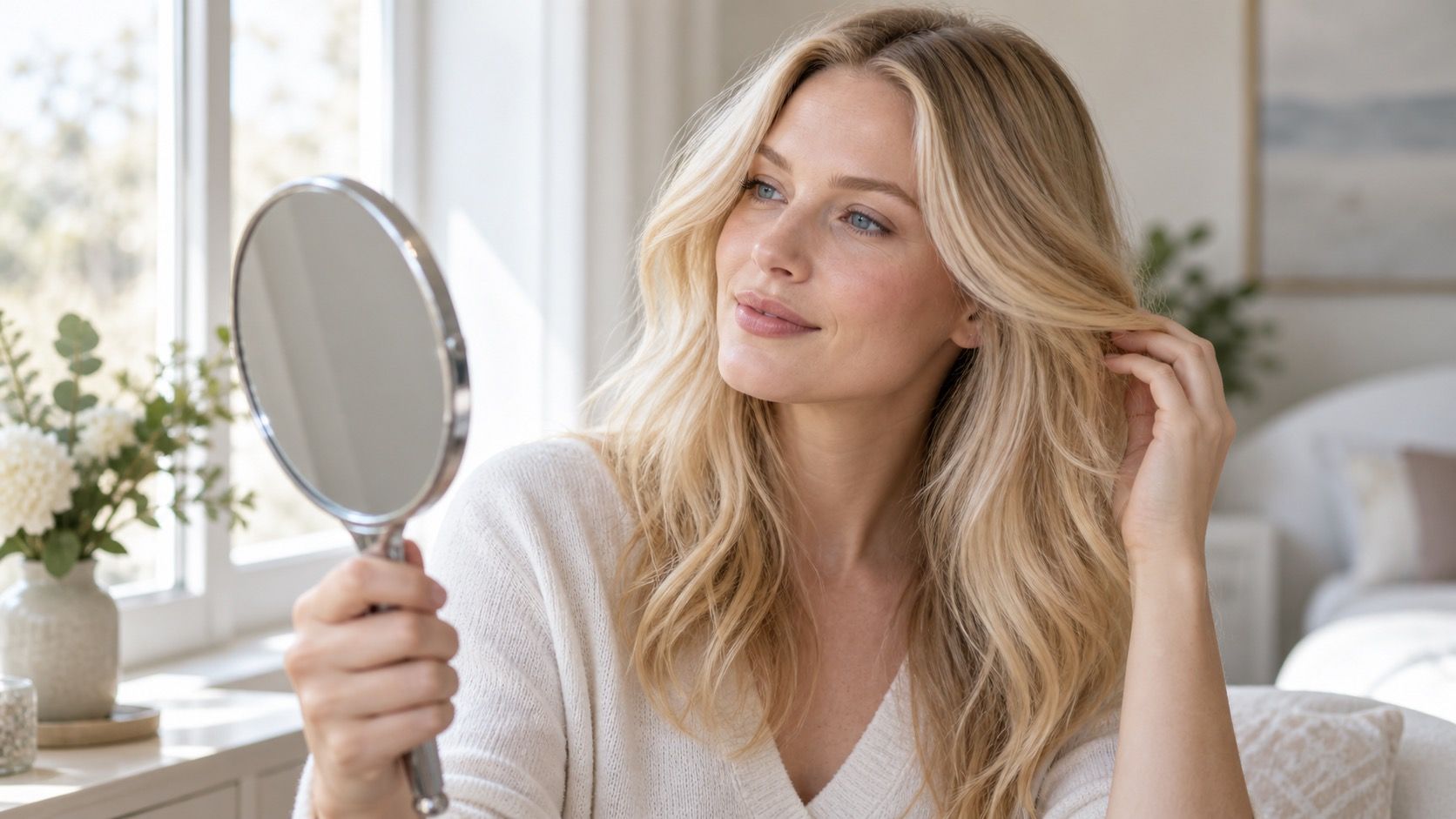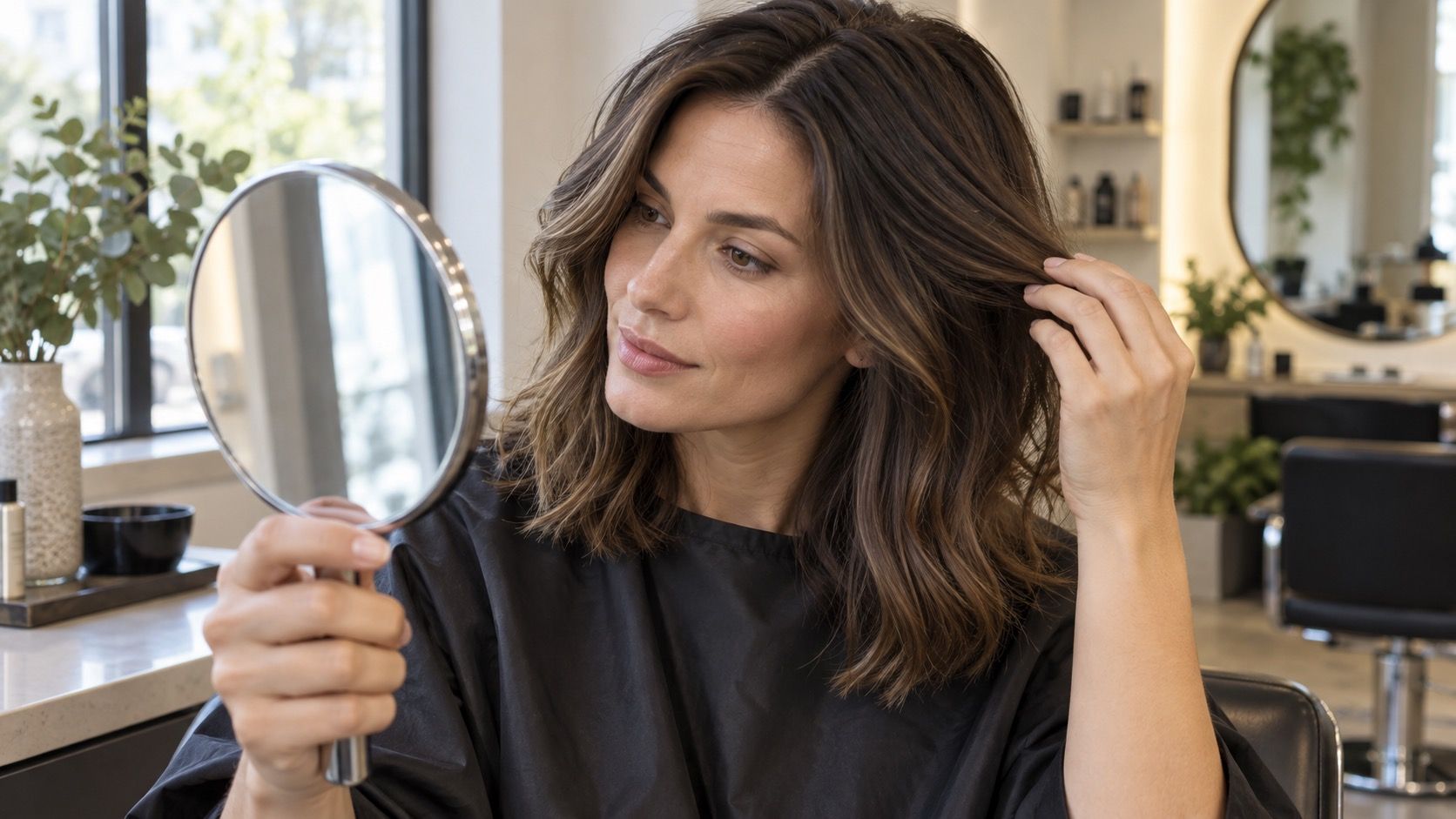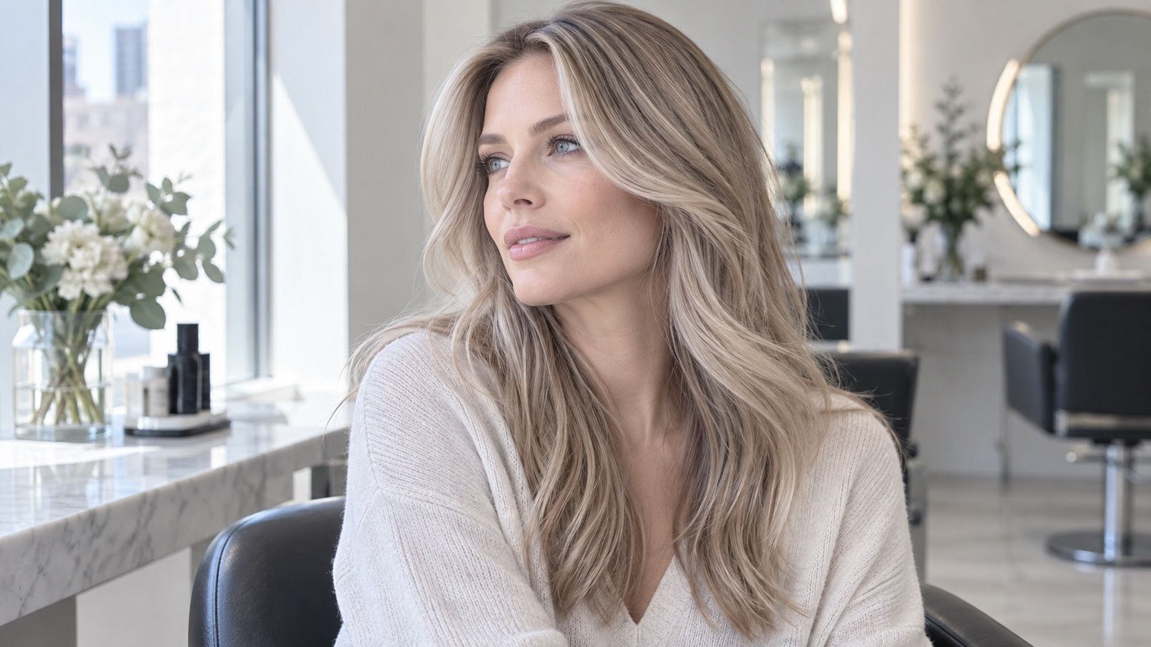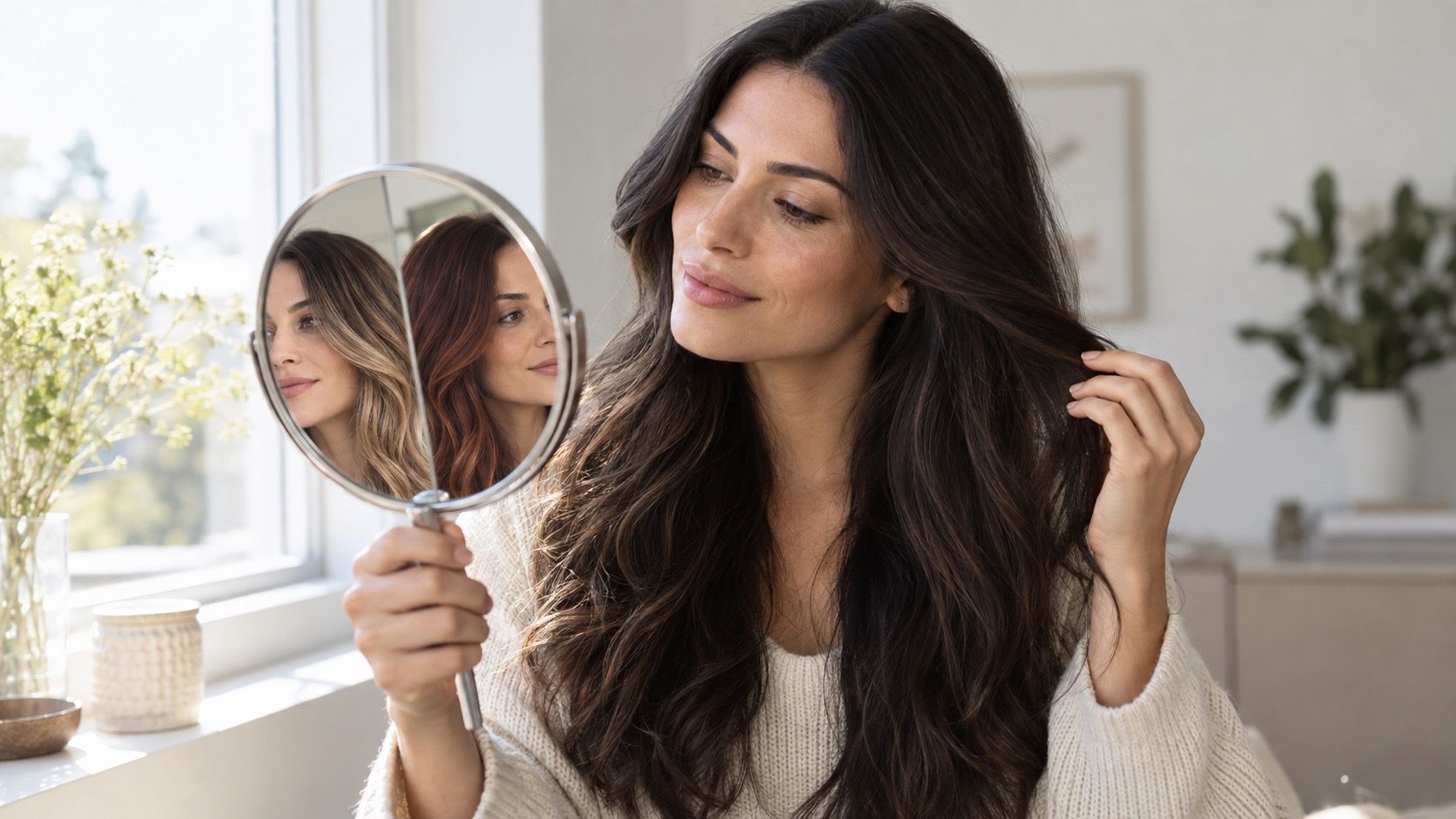
A virtual hair color try-on can be remarkably good at answering one modest question: does this colour direction make my face look clearer or more tired? It cannot tell you the exact salon formula, how porous ends will take pigment, or whether you will enjoy the upkeep. Treat it as a fitting room, not a signed contract, and it becomes much more useful.
Choose a photo that gives the preview a fair chance
The strongest starting image is a recent, unfiltered head-and-shoulders photo taken facing a window. Keep your head upright, let the whole hairline show, and use a plain background that does not echo a strong colour onto your face. A photo from a bright beach, a club bathroom, or a car with tinted glass may look flattering but confuses the preview. The software is trying to separate hair from skin and background; dramatic lighting makes all three look unreliable.
Take two versions if you can: one in soft window light and one in open shade outdoors. Avoid portrait-mode blur around flyaways, beauty smoothing, and filters that whiten teeth or change skin temperature. If your hair is tied back, partly hidden by a hat, or covered by a large fringe, the virtual result may paint a smooth block where real hair has roots, texture, and gaps. A clean photo is not about looking glamorous; it gives you a result you can judge.
Ask the try-on a narrow question first
Do not begin by tapping every colour in the grid. Start with a family: lighter, deeper, warmer, cooler, or more dimensional than your current hair. That keeps the comparison meaningful. If your natural root is medium brown, test a beige brown, a golden brown, an ash brown, and a deeper brunette before you jump to copper, platinum, and black. You will learn whether the change in temperature or the change in depth is driving the reaction.
Virtual hair colour try-on images are particularly good at showing face framing. Look at the area around the temples, the shadow under the cheekbones, and whether the eyes become the focal point or disappear. A shade can look beautiful as hair and still be wrong for the face in the image. Save the versions that make you look rested rather than merely transformed. That distinction is subtle on a tiny screen and obvious when you place screenshots next to each other.
Compare side by side instead of trusting the first wow moment
Novelty has a strong effect. A platinum preview can feel exciting simply because it is so different from the person in the original picture. Create a four-image comparison with the original first, then three candidates. Keep the crop, zoom, and expression identical. If the tool changes the background or adds makeup in one version, discard that comparison; it has introduced another variable. The best choice is usually the one that keeps looking convincing after the initial surprise fades.
| Preview result | Likely useful signal | What still needs real-world checking |
|---|---|---|
| Your skin looks even and eyes stay visible | The depth and temperature may be promising | How the tone behaves on your starting pigment |
| Hair looks like a flat helmet | The shade may be too solid for the simulation | Whether highlights or a root shadow would soften it |
| One version looks good only with a changed filter | The comparison is not dependable | Retake the photo in neutral daylight |
| Roots look much darker than lengths | A blended grow-out may matter to you | Placement, maintenance and appointment timing |
Give each candidate a plain label in your screenshots: ‘close to current,’ ‘warmer,’ ‘cooler,’ or ‘deeper.’ It is more helpful than invented colour names. When you revisit them the next morning, the contrast between the options becomes easier to see. A virtual try-on is a decision aid, and decisions improve when you can describe what changed.
Watch for the places a preview tends to cheat
Most tools are better at the broad outline of hair than at fine reality. Curly texture, wispy bangs, very dark hair, light-reflective grey hair, and hair against a busy background can all produce painted-looking edges. The same is true of highlights: a preview may lay bright ribbons across hair that would need several appointments to create safely. If the result seems too perfectly blended, assume it is an illustration of direction rather than a map of the process.
Root shadow is another common trick. A virtual image can make a blonde look relaxed by preserving a soft natural root, but a real result depends on where that root begins, how it fades, and how quickly your own hair grows. Zoom in on the parting and temple area. If the preview hides those zones, take it less seriously. They are the places you will notice first in a mirror at week six.
Test lighting before you call a shade flattering
Switching a phone display from warm night mode to its ordinary setting can change a caramel brown into something much closer to ash. Compare your saved images on the same device and, if possible, look at them in daylight. Do not make the selection at midnight under a warm lamp. Screens exaggerate shine and can compress the small differences between beige, gold, copper, and red that matter once hair is outdoors.
Look for colours that remain believable across both source photos. A candidate that works in the window shot but collapses in outdoor shade may be responding to the lighting rather than to your features. That does not automatically rule it out; it tells you to ask for a softer or more neutral version. Real hair is viewed in changing light, and a worthwhile colour has more than one good angle.
Bring a shortlist, not a digital promise, to the salon
Choose two or three saved previews and explain what you responded to in each. Say whether you liked the lighter pieces near the face, the neutral overall depth, or the way the cooler tone made your eyes stand out. A colourist can translate those observations into placement and formula. They cannot safely promise that an app’s uniform violet-brown overlay will appear on hair carrying old highlights and warm pigment underneath.
Include your hair history: permanent dark dye, henna, bleach, previous red, keratin treatments, or box colour all affect the route. Ask what can be achieved in one appointment, what needs a gradual plan, and how the chosen colour will fade. The screenshot is still useful—it prevents vague language—but the useful outcome of a hair color try on is a clearer conversation, not the belief that a button has already coloured your hair.
Make a final check against your real routine
Before committing, picture the shade at the moments the preview does not show: with dry shampoo at the root, in rain, tied back for the gym, or after six weeks without a gloss. A pale all-over blonde, a vivid copper, and a very cool brunette can look excellent in a virtual portrait while requiring different levels of toning, root coverage, and careful washing. There is no universal low-maintenance choice; there is only a maintenance level that fits your calendar.
Keep the version that feels like an enhancement rather than a costume unless you deliberately want the costume. The benefit of trying on hair colour virtually is that you can have both conversations with yourself before you spend money or put stress on your hair. One is about taste. The other is about reality. A good choice has room for both.